Branding Case Study: Equal Path Investments
Vision: "Empowering Futures, Equally."
Click images to view live documents, posts, and websites.
Equal Path Investments aims to redefine financial planning by challenging the status quo in a predominantly male-owned industry and empowering diverse clients through innovative and inclusive solutions.
Challenge
Establish a brand that is both female-forward and inclusive, appealing to a broad clientele while maintaining a competitive and sophisticated market position.
Brand Identity
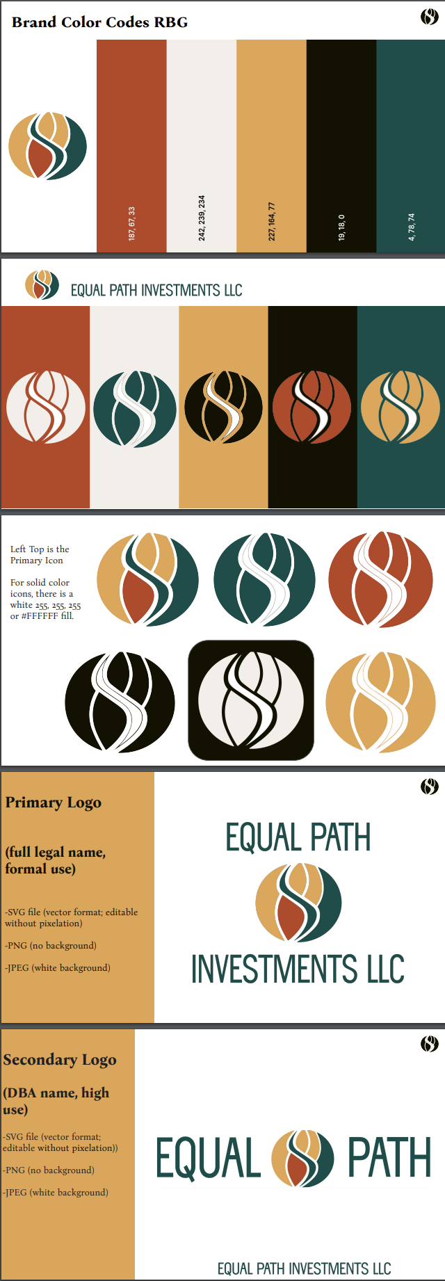
Logo: Symbolizes equality and financial empowerment.
Color Palette:
Blue/Slate: Trust.
Green/Teal: Growth.
Warm Rust: Optimism.
Tagline: "Investing in Equality, Building Futures."
Target Audience
Diverse Individuals: Seeking financial empowerment.
Socially Conscious Investors: Interested in impactful investments.
Communities: Breaking barriers to financial success.
Brand Strategy
Messaging: Position as a leader in financial education, innovation, and systemic disruption, with a focus on long-term client prosperity.
Content: Develop authoritative blogs, videos, and social media to engage and educate target audiences.
Partnerships: Collaborate with institutions and impact-driven organizations to expand reach and credibility.
Customer Experience
Digital Platform: Redesign for a seamless user journey and personalized support.
Community Building: Engage through local initiatives and online forums to build brand loyalty.
Key Metrics
Increase in brand awareness (traffic, social engagement).
Higher client satisfaction and retention.
Growth in financial literacy and community impact through partnerships.
Adaptation and Growth
Leverage market trends and client feedback to refine strategies.
Expand geographically and diversify offerings to strengthen market position.
Outcome
The strategic rebranding positioned Equal Path Investments as a modern, inclusive leader in the financial sector, driving growth and fostering trust through a cohesive brand identity and targeted outreach.


